Francien Rutten
A calm, Dutch-language site for a therapist, in night blue, moonlight and rosewood, with a phone dock shaped like a pebble.
Built for Francien Rutten's practice in depth psychology and bodywork in Eijsden (NL). In development, not yet on her own domain.
- Sector
- Depth psychology & bodywork · Practice site
- Year
- 2026
- Services
- Web design, Development, Mobile navigation
- Stack
- Next.js, React, Tailwind CSS, TypeScript, Vercel
(01)The idea
People looking for a therapist arrive unsettled. The site had to feel quiet and safe before it says anything, and make the first step (getting to know each other) the easiest thing on every page.
For women who want to feel free in their body, their expression and their emotions. The site speaks to them directly, in Dutch, and in the tone of the practice: unhurried and warm.
Every page ends in one step: Kennismaken, a free introduction. The design makes that step easy to find without ever pushing.
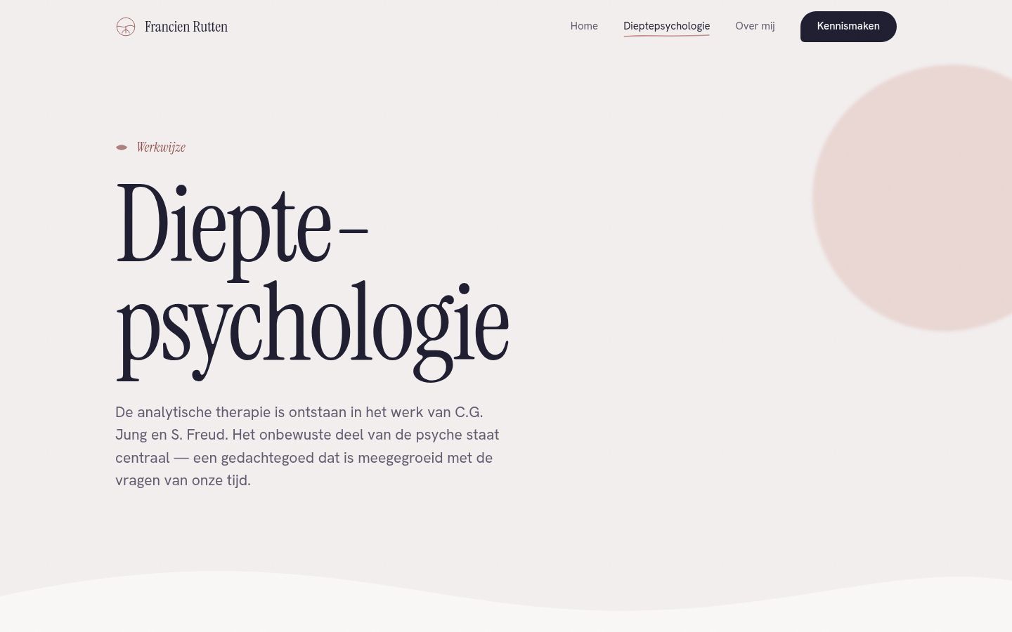
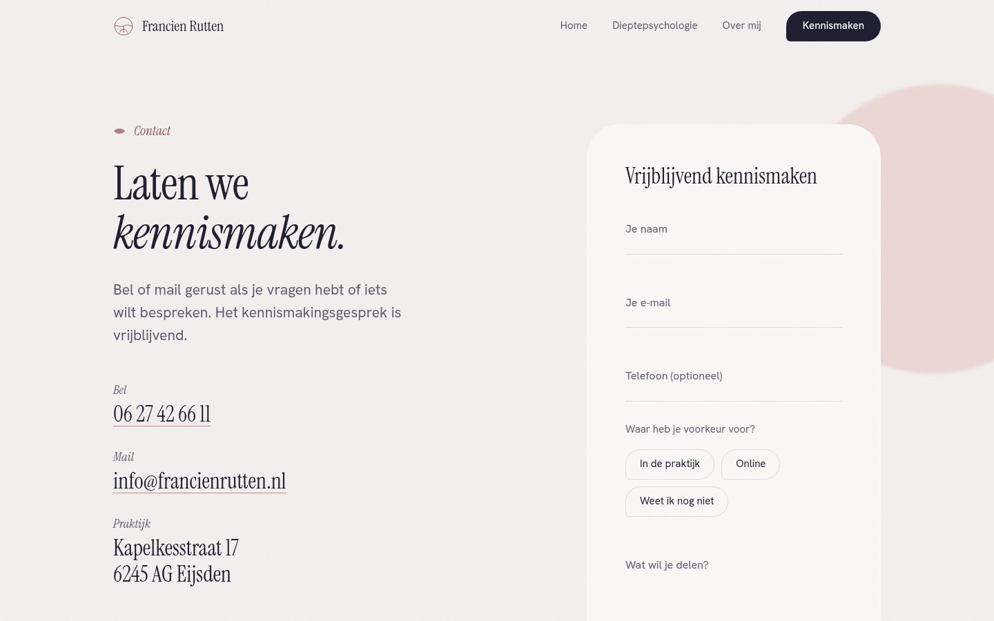
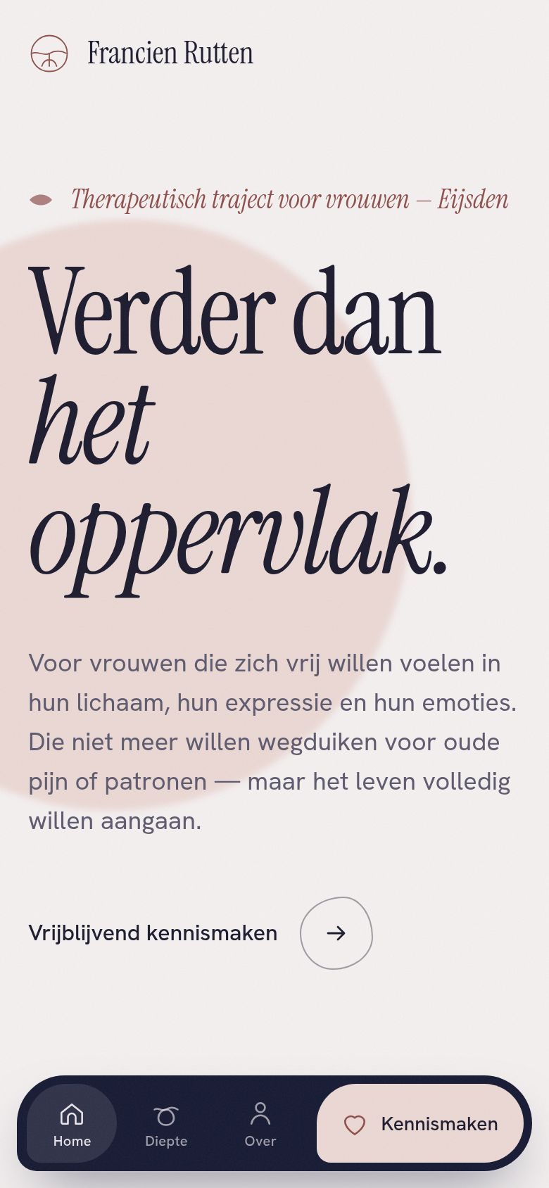
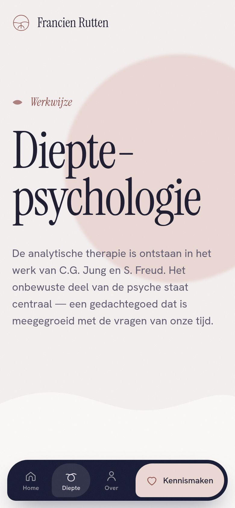
Screens
(02)Design choices
Colour
- Nacht#161A33Depth, the dock, dark sections
- Maan#F4F0F0Ground, space
- Inkt#1C1B2EText
- Rozenhout#C48B86Warmth, surfaces and lines only
- Rozenhout tekst#8E4F4BRosewood as readable text (5.6:1)
- Blos#EBD8D4Soft shapes, Kennismaken
- Lavendel#C9C3DCSoft shapes
Type
- Instrument SerifDisplay and headings, with one phrase set in italic.
- Hanken GroteskReading text at 17 px with a 1.7 line height, and the interface.
Colour
Night blue for depth, moonlight for space, rosewood for warmth. Rosewood only ever fills a shape or draws a line. Where it has to be read, it is darkened to #8E4F4B so it passes WCAG AA.
Type
A tall, quiet serif at display size, "Verder dan het oppervlak", with the second half in italic. A soft grotesk for everything you read. Both scale fluidly from a 390 px phone to a 1280 px desktop.
Motion
Slow and bodily. Soft shapes breathe and drift behind the text, line ornaments draw themselves, a quote lights up word by word and a winding timeline fills as you read. All of it stops for visitors who prefer reduced motion.
Layout
One grid (1240 px, 12 columns, 20 to 64 px margins) that everything aligns to. Sections switch between moonlight, paper, blush and night, joined by soft wave edges instead of hard lines.
(03)The approach
- 01
Night blue for depth, moonlight for space, rosewood for warmth. Rosewood is only ever a surface or a line; where it has to be read as text it is darkened to pass WCAG AA.
- 02
On phones, a floating pebble-shaped dock instead of a glass bar: three places on the left and one rose pearl on the right for Kennismaken, so the most important action gets its own shape.
- 03
Every practice detail (address, phone, email) lives in one file, which the footer, the contact page and the structured data all read from.
(04)The stack
- Next.js 16
- Every page is prerendered as static HTML, so it loads instantly and costs nothing to run.
- React 19
- One component per element (section, title, organic image, wave, ornament…), with a catalogue; pages only compose.
- Tailwind CSS 4
- The palette lives as tokens in one @theme block, with a fluid type scale next to it.
- TypeScript
- All practice details (address, phone, email, links) live in one typed file.
- next/font
- Instrument Serif and Hanken Grotesk are served by the site itself, not fetched from a font service on every visit.
- Vercel
- Hosting and preview deploys.
(05)In the details
- 01
The Schelp, a dock with its own shape
On phones, a dark pebble with soft asymmetric corners floats above the page. Three places sit on the left and one blush pearl on the right for Kennismaken, so the most important step gets its own shape.
- 02
The iceberg, drawn as a drop
The depth psychology page draws the waterline: the small conscious part above, the large unconscious part (95 %) below. Under water the shape is soft and round, a drop rather than ice.
- 03
A form that opens your mail
The introduction form doesn't send data to a server. It opens the visitor's own mail app with everything filled in, so nothing personal is stored anywhere but in the conversation itself.
- 04
Her own words
Fragments from Francien's Instagram posts appear on the site, each one linking back to the original post.
(06) The outcome
Four pages (home, depth psychology, about, contact) on a fluid type scale from phone to desktop, with Instrument Serif and Hanken Grotesk.
Let’s talk
Let’s build
something uncommon.
A free, no-pressure intake call. You’ll leave with a clear scope and a fixed quote.