GRØNN Studio
A bilingual site for a garden design practice that sells the person and the real work, and follows the light of the visitor's own day.
Live work for GRØNN Studio, the ecological garden and landscape practice in Stein (NL) run by UNCODED's founder.
Visit gronn.studio (opens in a new tab)- Sector
- Ecological garden design · Studio site
- Year
- 2026
- Services
- Web design, Development, Brand application, Accessibility
- Stack
- Next.js, React, Tailwind CSS, TypeScript, Vercel, Playwright
(01)The idea
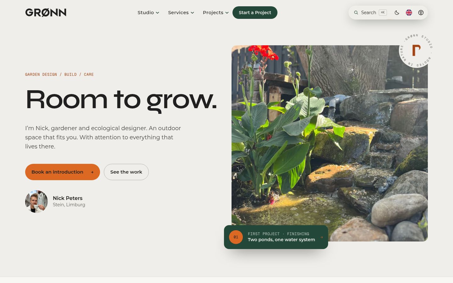
Garden design is bought on trust: who is going to walk your ground, and what have they actually made? GRØNN needed a site that says in one screen who it is for, what it is known for and why it is different, with nothing on it that isn't real. No stock gardens passed off as projects, no invented numbers.
One screen has to answer three questions: who is this for, what is it known for, and why is it different. So the home page leads with the person, Nick, and with a photo of real work, not a stock garden.
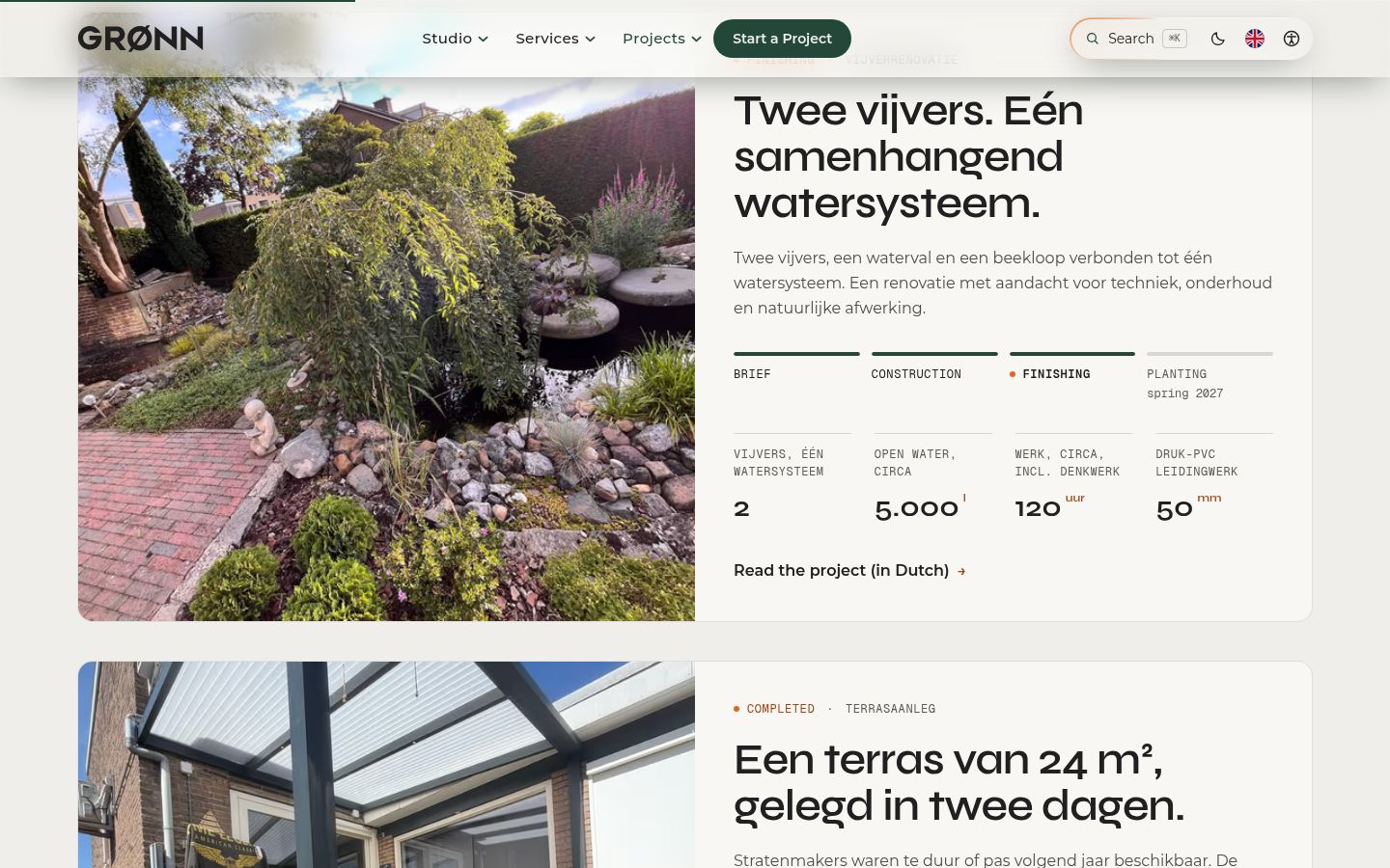
Everything on the site had to be true and checkable. Two real projects instead of a portfolio of placeholders, mood images that say they are mood images, and prices shown where a fixed price is possible.
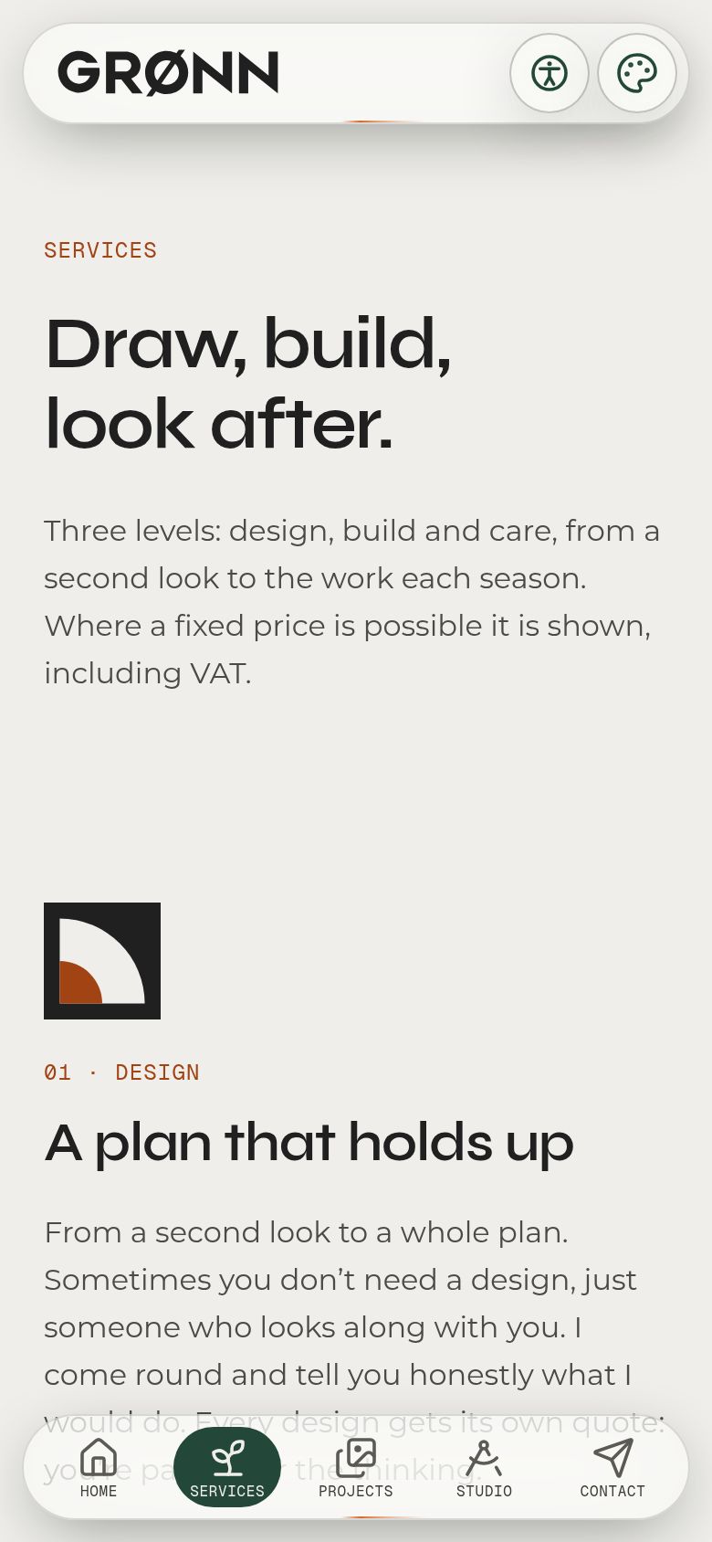
Screens
(02)Design choices
Colour
- Aarde-oranje#DB6923The one action colour
- Gebroken wit#EFEEEALight ground
- Antraciet#202020Text, dark ground
- Bosgroen#23483ADeep sections, active state
- Mosgroen#607A59Secondary green
- Salie#B8C5A8Soft green
- Donker oranje#A14312Orange as text on light
Type
- Syne SemiBoldHeadings. Self-hosted, cut down to the Latin set.
- MontserratBody and interface, with a real 400 to 600 weight axis.
- Geist MonoField annotations and labels, like notes on a survey drawing.
Colour
Straight from the GRØNN Brand Guide 2026: 60 % light, 30 % dark, 10 % accent. Orange as a fill carries antraciet text (4.70:1), never white. As text on the light ground it darkens to #A14312, because the brand orange on off-white is only 2.99:1.
Type
Syne gives the headings character, Montserrat stays out of the way, and Geist Mono marks anything technical. Sizes are fluid, running with clamp() from a 390 px phone to a 1280 px desktop. Text may grow; the navigation chrome is fixed in pixels so it never breaks.
Motion
Small and precise beats big and decorative. Reveals and a reading progress line run on CSS scroll timelines over native scrolling, with no smooth-scroll library. Every animation has a reduced-motion fallback.
Layout
A 1280 px grid with 24 and 64 px margins. Everything is round: pill buttons, and 16 px corners for cards and photos alike. Pages are assembled from one component per element, so a new part becomes an element first.
(03)The approach
- 01
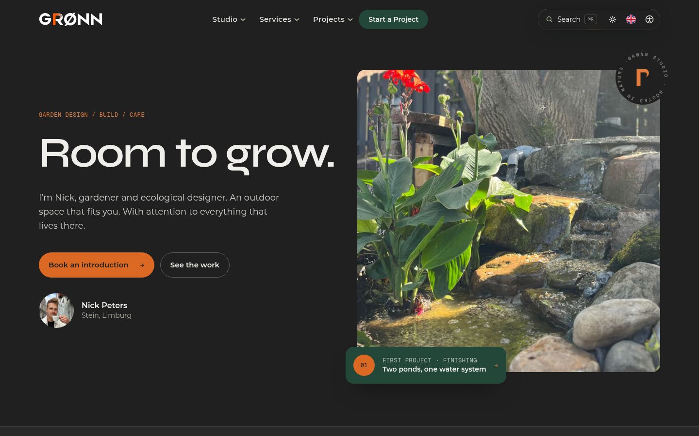
Two palettes named after the light, Golden Hour and Blue Hour, that follow the visitor's own clock. A script runs before the first paint so a returning visitor never sees the wrong ground flash.
- 02
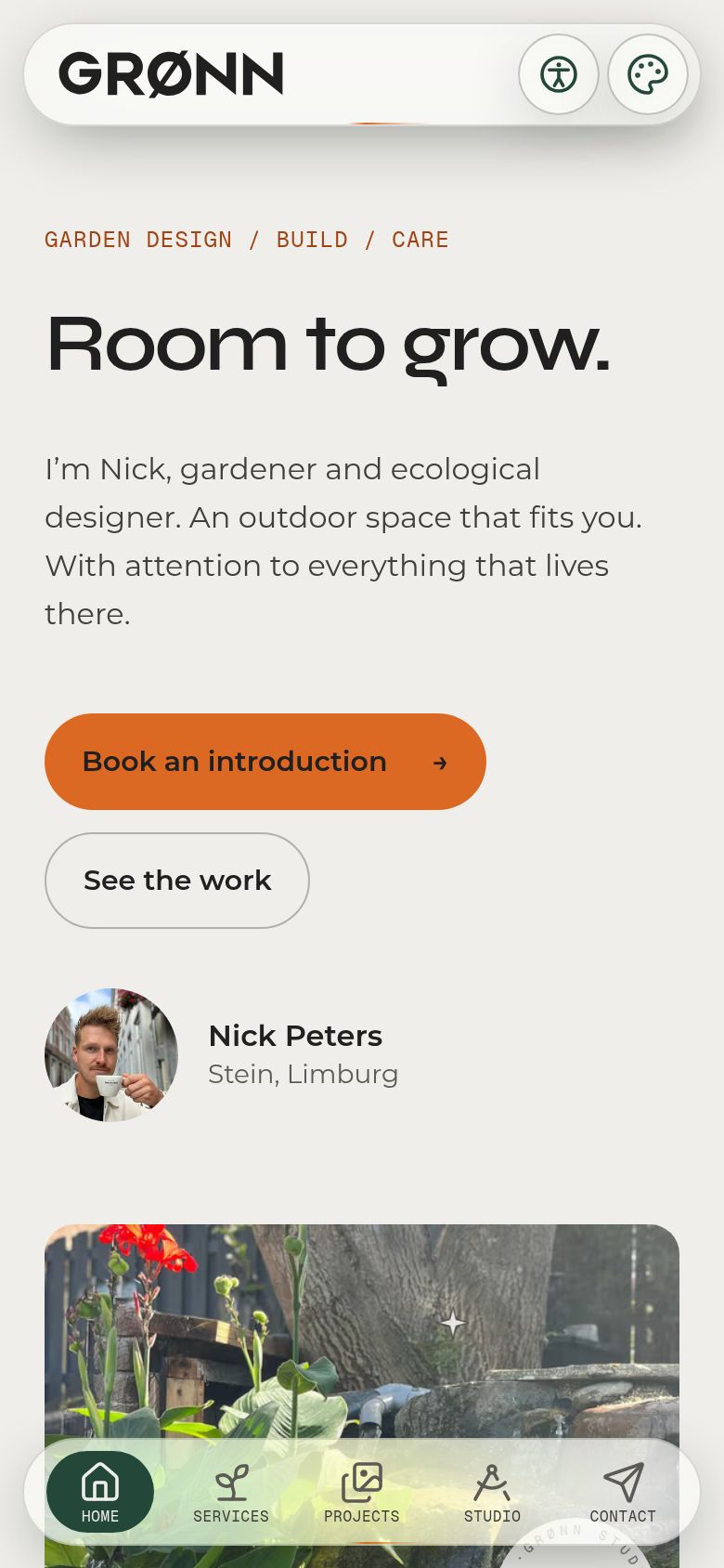
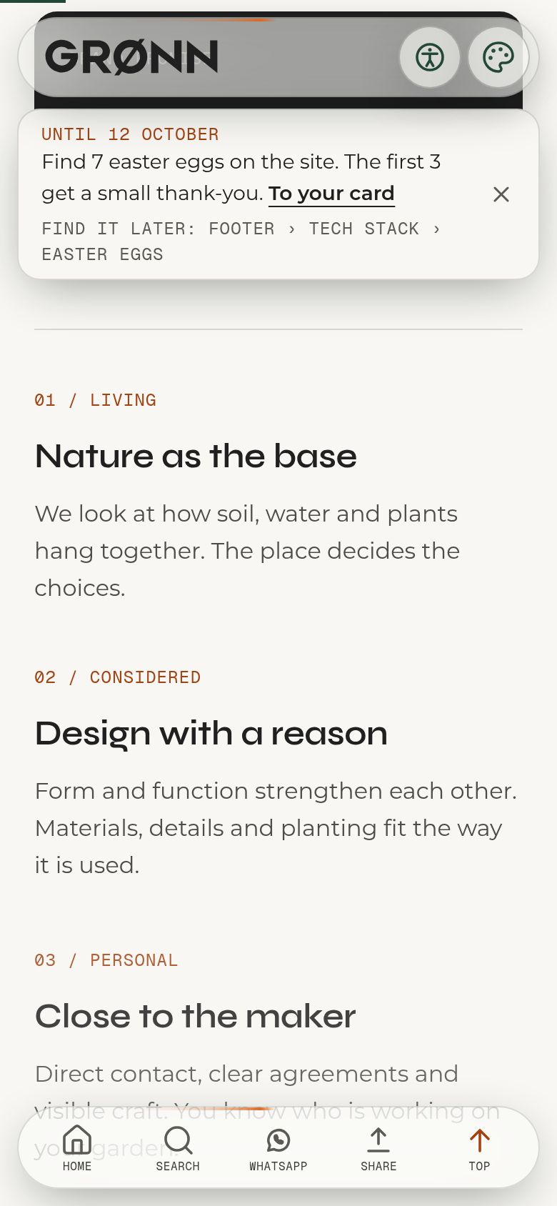
On phones, one dock at the bottom that folds into a compact reading bar while you scroll, sized in pixels so it holds its shape at 125 % text and tested from 320 to 430 px wide.
- 03
Only real work: a pond renovation with the client's own photos, stripped of location data, and a terrace in Geulle. Mood images carry a visible label and never stand next to a project.
- 04
Contrast is measured, not guessed: a script checks every colour pair of the brand guide against WCAG AA, and a test photographs the navigation glass over the heaviest photo and demands 3:1.
(04)The stack
- Next.js 16
- App Router with server pages for metadata and client components only where something moves. The same app runs a client portal and owner tools.
- React 19
- The component model behind the elements catalogue.
- Tailwind CSS 4
- Every colour is a semantic token in one stylesheet, so two themes are two sets of variables, not two sets of components.
- TypeScript
- Content is typed data (projects, services, business details) instead of a CMS. The business identity lives in one file that footer, legal pages and structured data all read.
- Vercel
- A push to main is a production deploy; branches get preview URLs.
- Supabase + Auth.js
- Behind the client portal and the owner's editor, never on the public pages.
- Playwright + axe
- End-to-end tests on 320 to 430 px phones, accessibility checks, and a contrast test that decodes a screenshot of the dock over the heaviest photo and demands 3:1.
(05)In the details
- 01
The hours follow your clock
Golden Hour from 07:00, Blue Hour from 19:00, on the visitor's own clock. One labelled button cycles Auto, Light and Dark. A script runs before first paint so returning visitors never see the wrong colour flash.
- 02
A dock that folds while you read
On phones, five labelled places: Home, Services, Projects, Studio, Contact. Scroll to read and it folds into Home, Search, WhatsApp, Share and Top, with the same glass and the same comet ring.
- 03
Glass that is measured, not chosen
The brightness behind the dock's glass was tuned per theme until every icon held 3:1 over the darkest photo on the site. If a test drops below, the glass changes, never the threshold.
- 04
Honest photos
Project photos are resized and stripped of location data, and a test checks it. An AI visualisation always carries a label, and mood images are labelled as mood and never shown next to a project.
- 05
A garden calendar for Stein
One rule of thumb per month, plus today's sun and moon, calculated in the browser for the studio's coordinates.
- 06
A link page on its own subdomain
links.gronn.studio is a bento-style link page served by the same app, via a host rule in the proxy. It has no menu, no dock and no footer.
(06) The outcome
Live at gronn.studio in English and Dutch, on the GRØNN Brand Guide 2026, with a garden calendar computed for Stein and a bento-style link page on its own subdomain.
Let’s talk
Let’s build
something uncommon.
A free, no-pressure intake call. You’ll leave with a clear scope and a fixed quote.